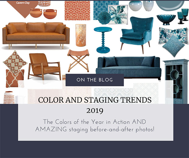
Oh how I LOVE to talk color, design and staging trends, as well as how they relate to our staging industry in the form of AMAZING before-and-after photo transformations! Here's my take on the Colors of the Year 2019 for Behr and Sherwin Williams thus far and how you will see them in staging trends within homes over the next year. Let me know what you think about these color and design trends for 2019...
Let's start with the Behr 2019 Color of the Year 2019, Blue Print
Blueprint which is a stylish mid-tone blue described by Behr as being an honest and approachable color. Behr's in-house color expert, Erika Woelfel, believes Blueprint is universally appealing, as it's "warmer than denim and softer than navy." Blueprint is able to work so well with other colors that you can layer in a second or third color to your decorating.
I've long been saying the blue is almost like another neutral in that it's become VERY livable and likable.
In the staging realm, it's a very safe color to accent a home with...especially any coastal home to bring in the ocean views. My AMAZING STAGING sister, Corrine McKendrick uses it quite often in her Santa Cruz staging projects because so many of the homes she stages are ocean front...
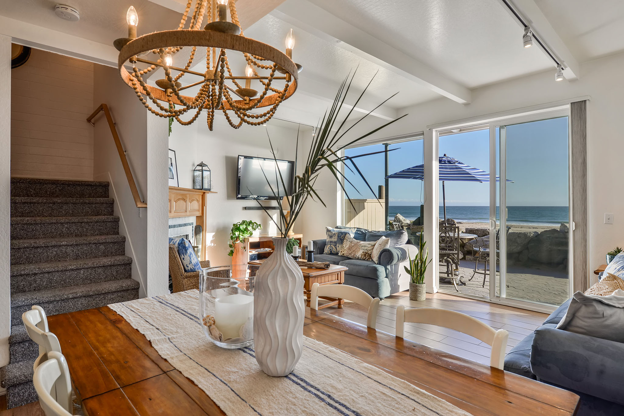
After Staging by Pacific Home Design
This Behr blue is so univeral that even Donna Dazzo, uses this faded denim like blue in a luxury New York City staged apartment in both the art and rug...
How CRAZY is this before and after photo?!
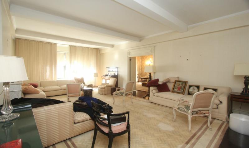
Living Room Before...
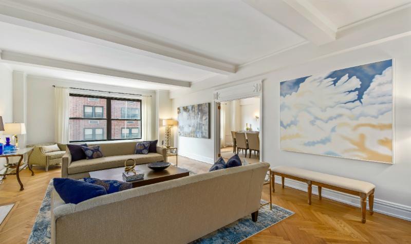
After Staging by Designed to Appeal
Holly of Gray Staging and Design in Indianapolis accents with blue chairs and matching pillows in this after photo below...
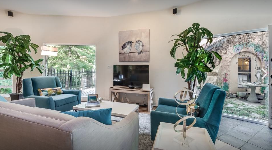
Staged by Holly Meyers
Here's another doozy of a staging before-and-after by Gail Emlaw of Gail's Staging and Design in Cape Coral, FL...what a HUGE transformation!
Do you ever get tired of looking at before-and-after photos?
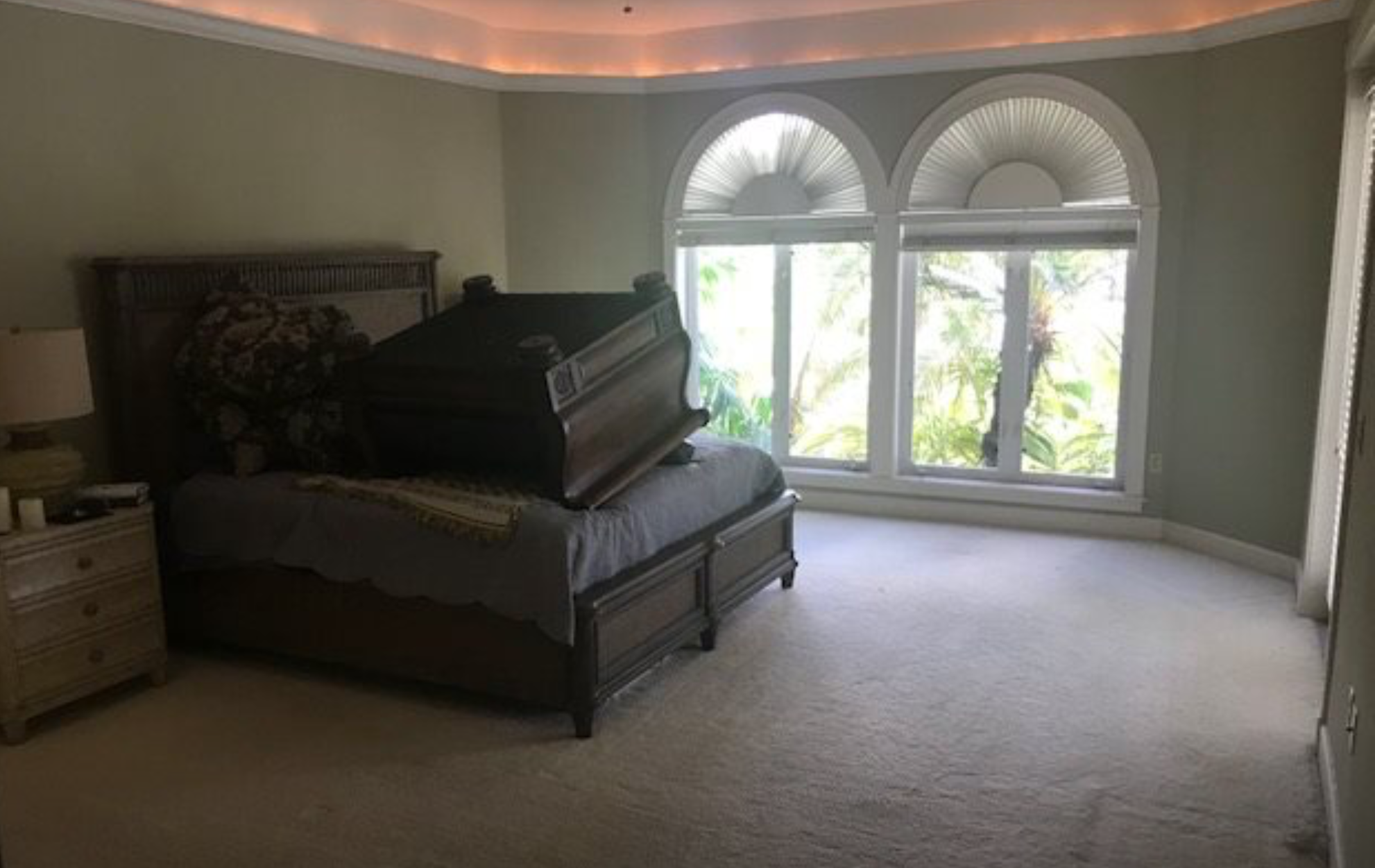
BEFORE STAGING
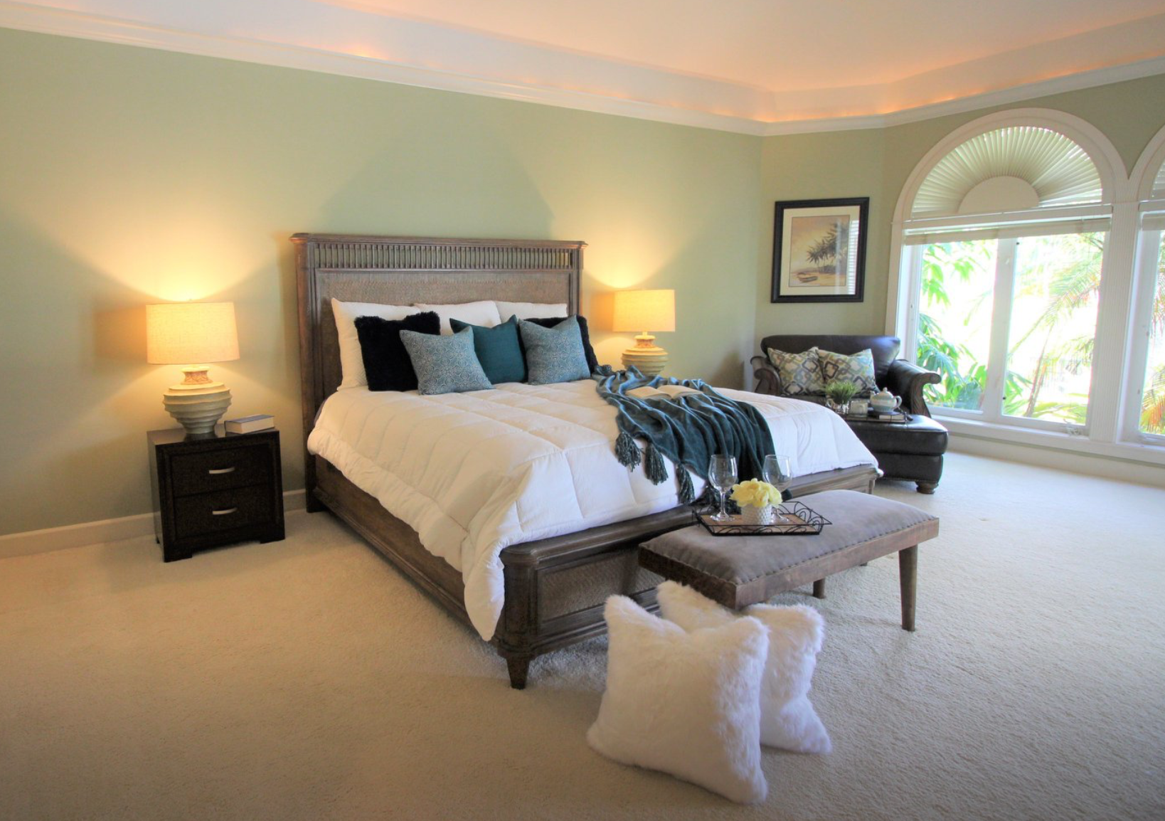
AFTER by Gail's Staging and Design LLC
All in all, I think Behr picked a VERY safe color that we can expect to see a lot of in the staging and design world. Since staging trends tend to follow the color trends and the paint companies are at the forefront of this, let's look at another newly announced Color of the Year...
Sherwin Williams Color of the Year 2019, Cavern Clay
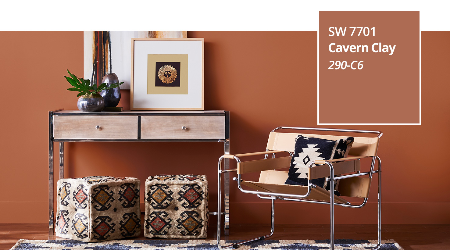
Courtesy of Sherwin Williams
No, you are NOT going to see this color on very many walls of a home EXCEPT in maybe an office space.
You will see this color in accents of leather, wood tones, clay pottery, amber glass and pillows. Personally, I love the leather chairs Stephanie White used in this AMAZING living space before-and-after...
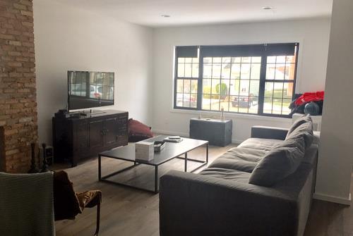
Living Space BEFORE
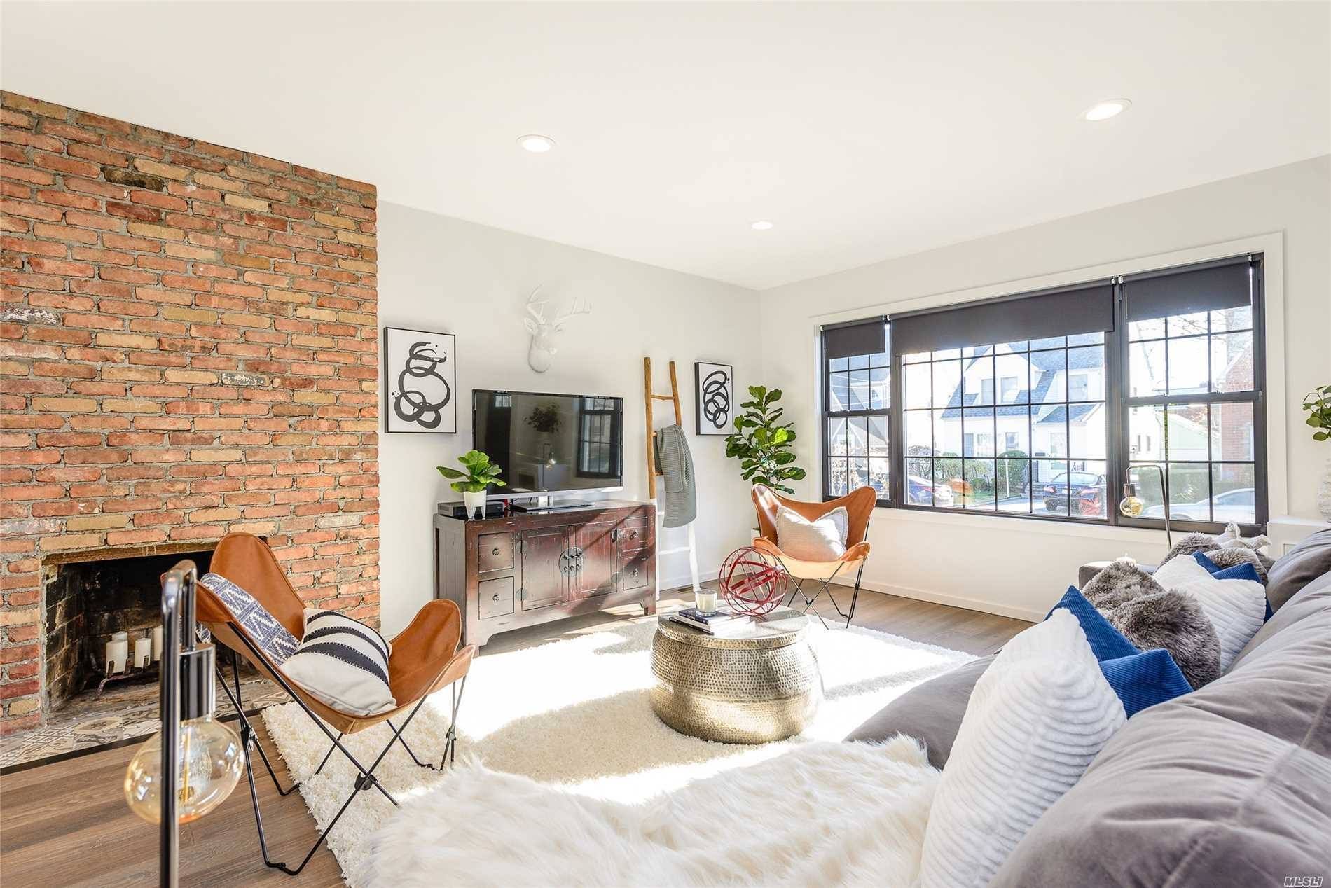
After Design by Stephanie White Interiors
The Sherwin Williams color choice was a bold one but they know the pulse of color trends which is trending towards muted colors...both the Behr and Sherwin Williams Colors of the Year fit that trend.
In fact, both of those color choices are complimentary in nature especially with similar muted tones...what do you think?
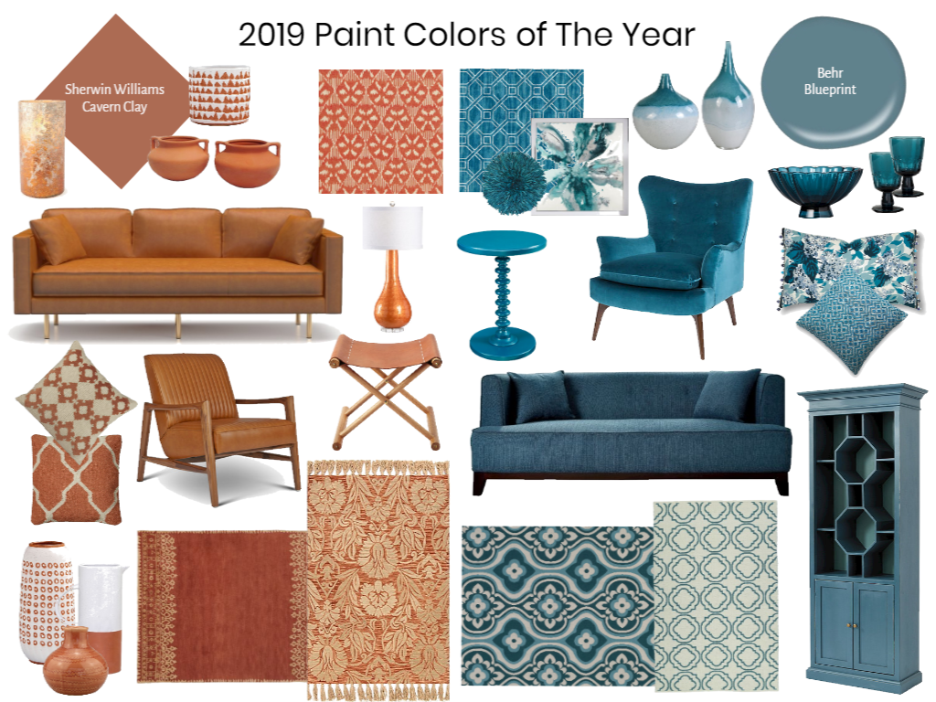
This 2019 Colors of the Year Mood Board was created in our E-Design Training account that all of our Expert E-Designers have access to use, share, blog and post on. If you're interested in learning how to create cool vision e-design boards for clients, then join me in this upcoming webinar...
You know you're on the right color trend track when you see it mass produced...
The Hearth and Hand with Magnolia collection at Target is making a big statement this season following these color trend combinations. I was SHOCKED to see very little color in their items EXCEPT for our Behr Blueprint and Sherwin Williams Cavern Clay:
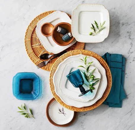
Magnolia Home-Target
These small accessories in Blueprint and Cavern Clay tones make a big impact and will liven up any table setting. Pairing the natural rattan woven chargers with the blue glass plates and glasses brings out the contrast and just the right pop of color. Cavern Clay can undoubtedly turn heads with its eye-catching color through décor made of wood, ceramic, leather and rattan while Blueprint shows off it’s color best in fabric, glass, linen and paint. You can spruce up any kitchen or dining table by sprinkling in these colors for a lasting impression.
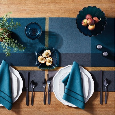
Magnolia Home Target
Two good color picks that go well together...it's almost like both paint companies coordinated their picks! It almost makes me expect to see the Pantone Color of the Year 2019 as a Mustard Yellow.

