If You LOVE Color - Hot Tips! Archives - HSR Home Staging Certification Training
Category Archives for "If You LOVE Color – Hot Tips!"

Color and Staging Trends 2019

3-color-new

Oh how I LOVE to talk color, design and staging trends, as well as how they relate to our staging industry in the form of AMAZING before-and-after photo transformations!   Here's my take on the Colors of the Year 2019 for Behr and Sherwin Williams thus far and how you will see them in staging trends within homes over the next year.   Let me know what you think about these color and design trends for 2019...

Let's start with the Behr 2019 Color of the Year 2019, Blue Print

Blueprint which is a stylish mid-tone blue described by Behr as being an honest and approachable color. Behr's in-house color expert, Erika Woelfel, believes Blueprint is universally appealing, as it's "warmer than denim and softer than navy." Blueprint is able to work so well with other colors that you can layer in a second or third color to your decorating.

I've long been saying the blue is almost like another neutral in that it's become VERY livable and likable.​

In the staging realm, it's a very safe color to accent a home with...especially any coastal home to bring in the ocean views.   My AMAZING STAGING sister, Corrine McKendrick uses it quite often in her Santa Cruz staging projects because so many of the homes she stages are ocean front...

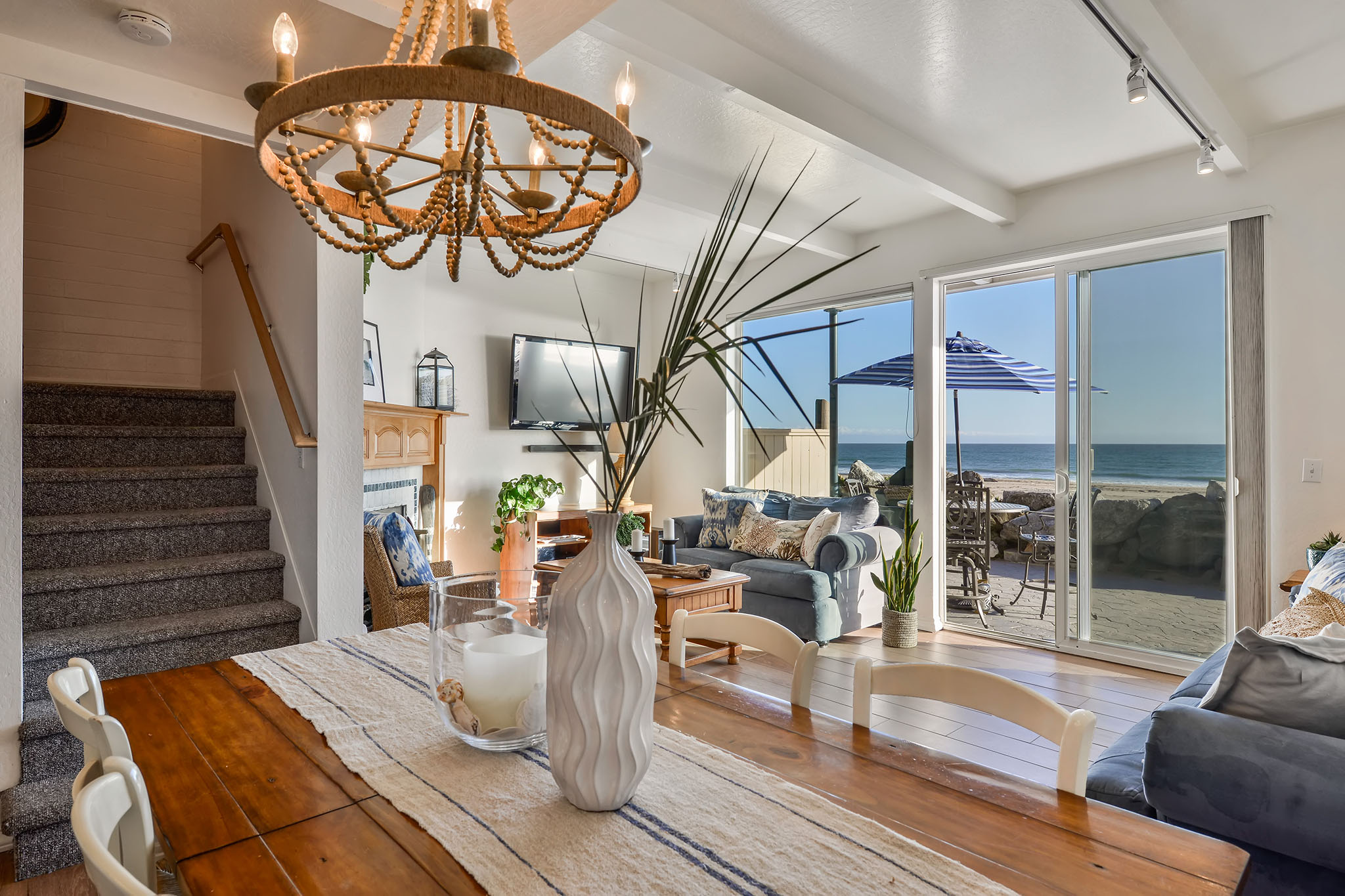
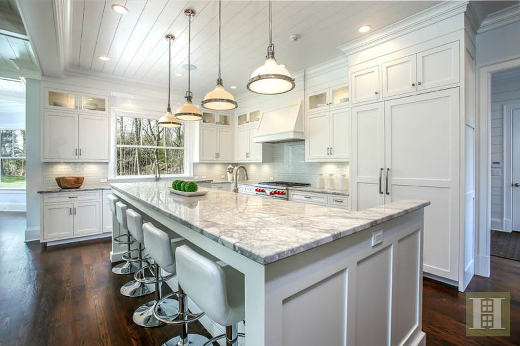
After Staging by Pacific Home Design

This Behr blue is so univeral that even Donna Dazzo, uses this faded denim like blue in a luxury New York City staged apartment in both the art and rug...

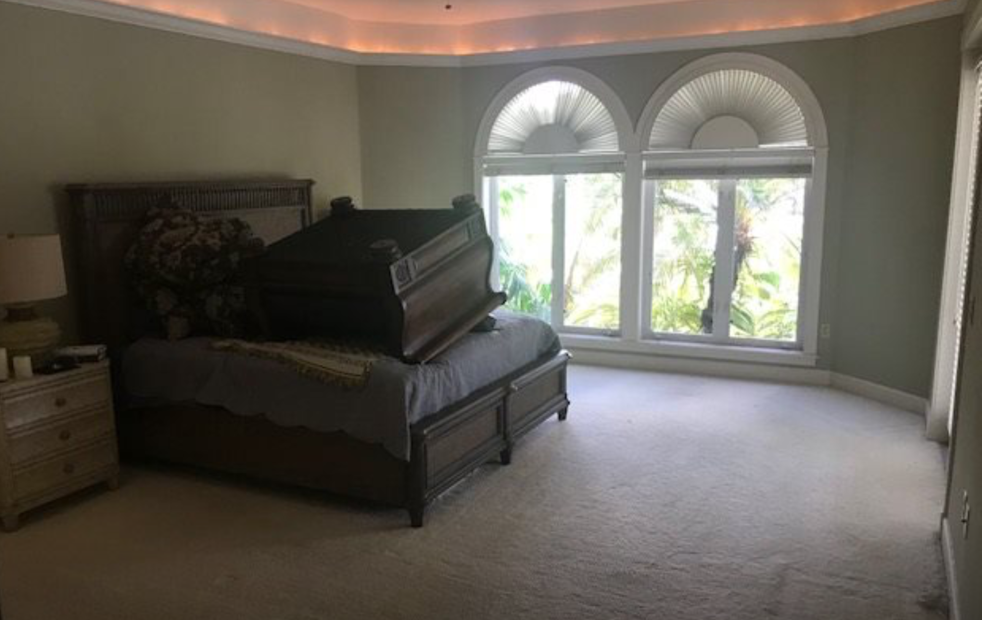
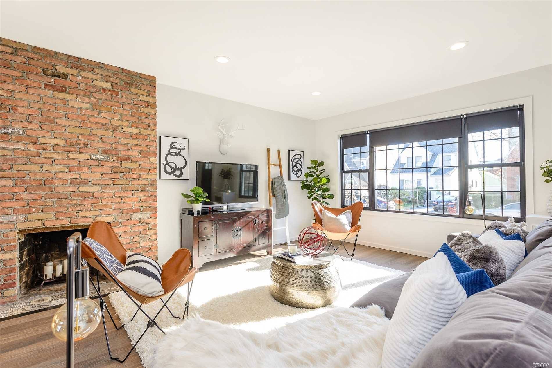
How CRAZY is this before and after photo?!​

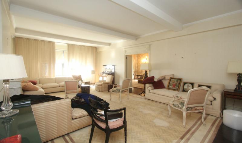
Living Room Before...

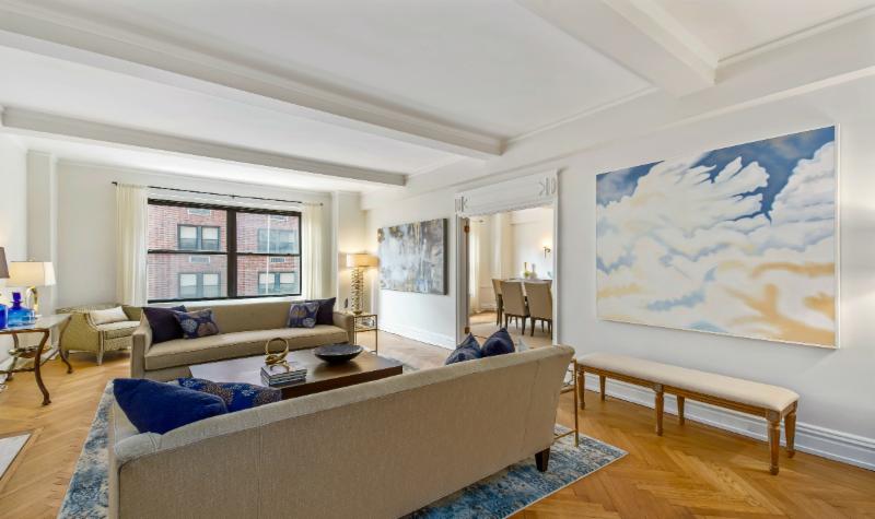
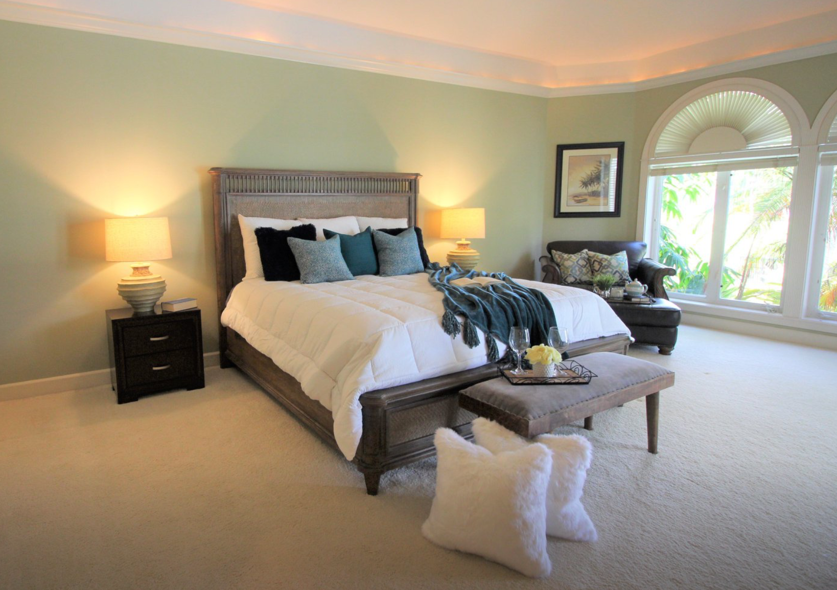
After Staging by Designed to Appeal

Holly of Gray Staging and Design in Indianapolis accents with blue chairs and matching pillows in this after photo below...

Staged by Holly Meyers


Here's another doozy of a staging before-and-after by Gail Emlaw of Gail's Staging and Design in Cape Coral, FL...what a HUGE transformation!

Do you ever get tired of looking at before-and-after photos?​

BEFORE STAGING

AFTER by Gail's Staging and Design LLC

All in all, I think Behr picked a VERY safe color that we can expect to see a lot of in the staging and design world.  Since staging trends tend to follow the color trends and the paint companies are at the forefront of this, let's look at another newly announced Color of the Year...

Sherwin Williams Color of the Year 2019, Cavern Clay​

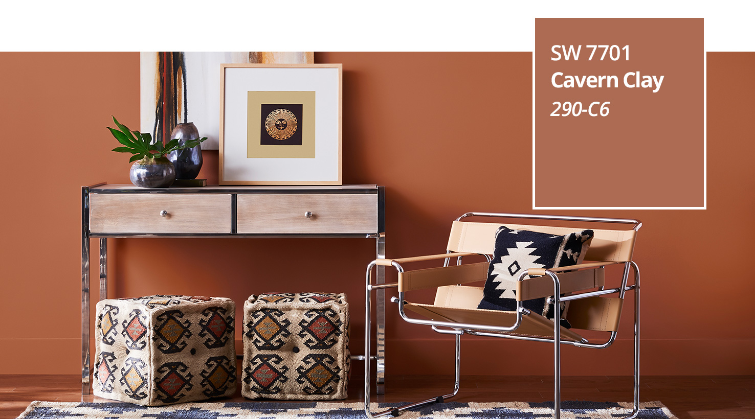
Courtesy of Sherwin Williams

No, you are NOT going to see this color on very many walls of a home EXCEPT in maybe an office space. 

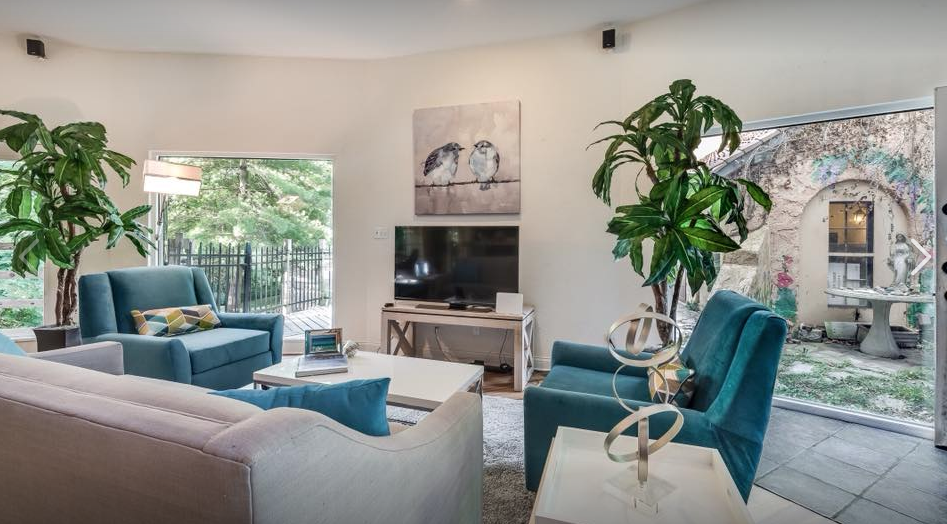
You will see this color in accents of leather, wood tones, clay pottery, amber glass and pillows.  Personally, I love the leather chairs Stephanie White used in this AMAZING living space before-and-after...

Living Space BEFORE

After Design by Stephanie White Interiors

The Sherwin Williams color choice was a bold one but they know the pulse of color trends which is trending towards muted colors...both the Behr and Sherwin Williams Colors of the Year fit that trend.

In fact, both of those color choices are complimentary in nature especially with similar muted tones...what do you think?


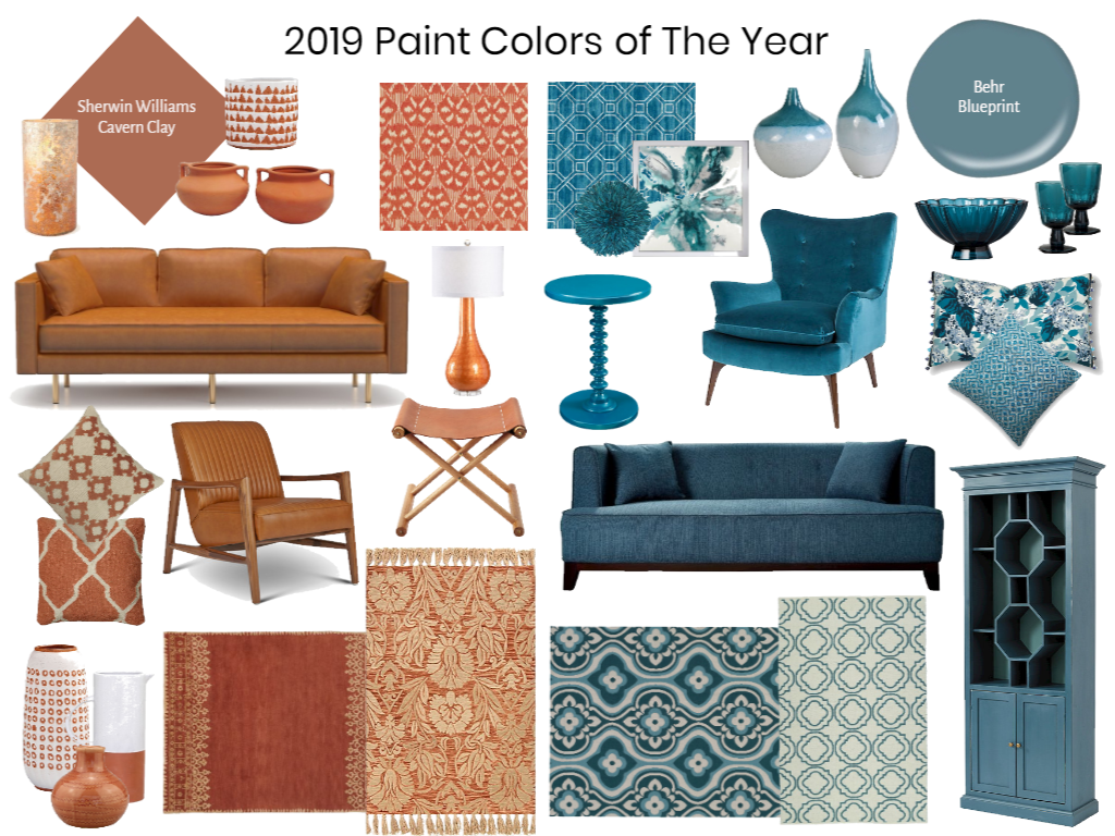
This 2019 Colors of the Year Mood Board was created in our E-Design Training account that all of our Expert E-Designers have access to use, share, blog and post on.   If you're interested in learning how to create cool vision e-design boards for clients, then join me in this upcoming webinar...

You know you're on the right color trend track when you see it mass produced...

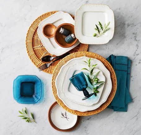
The Hearth and Hand with Magnolia collection at Target is making a big statement this season following these color trend combinations.  I was SHOCKED to see very little color in their items EXCEPT for our Behr Blueprint and Sherwin Williams Cavern Clay:

Magnolia Home-Target

These small accessories in Blueprint and Cavern Clay tones make a big impact and will liven up any table setting.  Pairing the natural rattan woven chargers with the blue glass plates and glasses brings out the contrast and just the right pop of color. Cavern Clay can undoubtedly turn heads with its eye-catching color through décor made of wood, ceramic, leather and rattan while Blueprint shows off it’s color best in fabric, glass, linen and paint. You can spruce up any kitchen or dining table by sprinkling in these colors for a lasting impression.

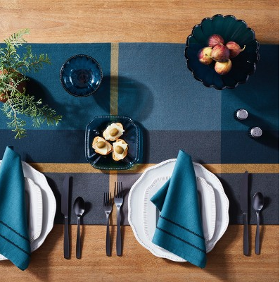
Magnolia Home Target


Two good color picks that go well together...it's almost like both paint companies coordinated their picks!  It almost makes me expect to see the Pantone Color of the Year 2019 as a Mustard Yellow.

Oh how I LOVE to talk color and design trends, as well as how they relate to our staging industry in the form of AMAZING before-and-after photo transformations!   Here’s my take on the Colors of the Year 2019 for Behr and Sherwin Williams thus far and how you will see them inside homes over the next year.   Let me know what you think about these color and design trends for 2019…

Paint Cheat Sheet

Did you know that by using certain paint colors in specific rooms of the home you can statistically increase it's value by almost $10,000 alone?! We have a "Paint Color Cheat Sheet" that shows you exactly how much...

I know this seems incredible but according to Zillow's Paint Color Analysis which looked at more than 32,000 photos from sold homes around the country...it's true.  "Homes with blue bathrooms alone typically sold for $5,440 more than expected" in this study!  We created a "Paint Color Cheat Sheet" according to this study, so your clients know which specific Benjamin Moore colors in each room of the home will garnish them them the most....

Paint color has a tremendous influence on the way a buyer views a home according to the Zillow study which calculated the increase in potential value per room depending on which "buyer preferred" paint color was used. 

"Color can be a powerful tool for attracting buyers to a home, especially in listing photos and videos," says Svenja Gudell, Zillow chief economist.  "Painting walls in fresh, natural looking colors, particularly in shades of blue and pale gray not only make a home feel larger, but also are neutral enough to help future buyers envision themselves living in the space.  Incorporating light blue in kitchens and bathrooms may pay off especially well as the color complements white counter-tops and cabinets, a growing trend in both rooms."

Personally, I think they are miscalculating in the sense that homes that usually have these gray and blue colors usually have white cabinets and marble counter tops which are REALLY HOT right now.  I never get tired of seeing photos like the one above which was done by HSR Grad Leia Ward of LTW Design a Greenwich, CT home stager.

Color evokes such a visceral response that I created a Certified Color Expert program, so people can navigate choosing color schemes for clients in the right way.  Color is not just about paint but about all the colors in the space, so it's important to work with what we cannot change in the space to find the perfect, complimentary color.

Did you know that by using certain paint colors in specific rooms of the home you can statistically increase it’s value by almost $10,000 alone?! We have a “Paint Color Cheat Sheet” that shows you exactly how much…

2016 Pantone Color of the Year Rocks the 80’s

When I saw the 2016 Pantone Color of the Year (which is not a single color but two colors in harmony), I was giddy with excitement!  Why?  Because when was the last time you saw dusty pink (Rose Quartz) and pale blue (Serenity) together?  Yep, you guessed it…the 80’s!

Pantone states that it’s intent in picking two colors was to reflect “connection and wellness as well as a soothing sense of order and peace.”  This is the first time they have ever picked two colors (which I love!)  “Anxious times call for calmer colors,” said Pantone.

The reality is, the last time you saw these two colors side-by-side was over 25 years ago at a time not that much different in “turbulence” and tension than today.

Remember these guys?  You couldn’t get through an episode without seeing our 2016 Pantone Colors on display in garb and interiors.  Crockett is wearing our 2016 Pantone Colors.  Be still my beating heart! But seriously…do you have any of this color combination in your closet or interiors?

No, probably not because I did several searches on Houzz and Google and you don’t see this color combination in interiors anymore.

When you have two prominent paint companies (Benjamin Moore and Sherwin Williams) choose variations of white as their color of the year, it feels as if Pantone’s made a very bold move.  Not only is it unconventional to pick more than one color (something they have never done), they have specified two colors that have not been seen in unison in 25 years!

It was all over the movie set interiors of the 1980’s…notice the dusty pink couch set and pale blue rug?


The 2016 Pantone color of the year, color combination was everywhere we looked!

I feel like we should have seen this coming since lately we’ve seen increased popularity of certain “elements of the 80’s” in the last couple years.  For instance, who hasn’t purchased brass (anything) and ginger jars in the last year?

What makes me giddy about moving towards the 80’s style is not only am I a product of the 80’s (class of 1989) but my love for interior design (inspired by my mother) was born in that decade.  That decade represents a certain fearlessness when it came to dress, style, interiors, music and culture that has not been seen since.

My mother had designed our living room in the 80’s with pale blue carpet, dusty pink chairs, brass framed photos and standing light fixtures, several ginger jars and of course a large white couch.  Pink and blue were everywhere in our house in the 80’s because it was hot, hot, hot!

It was the decade that celebrated the ridiculous and absurd while ushering in the “preppy” and “yuppy” sub-cultures.  It was truly a decade of diversity in a form that treasured being unique.

It was cool to NOT buy designer.  It was popular for boys to wear pink…or color your hair any color you prefer.


Is Pantone trying to usher in the carefree attitude of the 80’s or merely giving a nod to gender equality?  An even better question is…are we ready for the 80’s?

So…do we hold our breath and wait and see if it catches on or do we embrace it for all it’s worth?

Okay, I couldn’t resist this one…

Personally, I don’t think it looks too bad in this more modern setting…What do you think?

It’s interesting to me that the colors picked by Pantone this year have no relationship with last year’s pick (which many people were not fond of).  It’s almost as if Pantone said, “we better get it right this year and be cutting edge since we kind of blew it last year.”  Whatever their intentions I love to see the changes in design, color and trends…it’s what makes us home stagers and designers super happy!